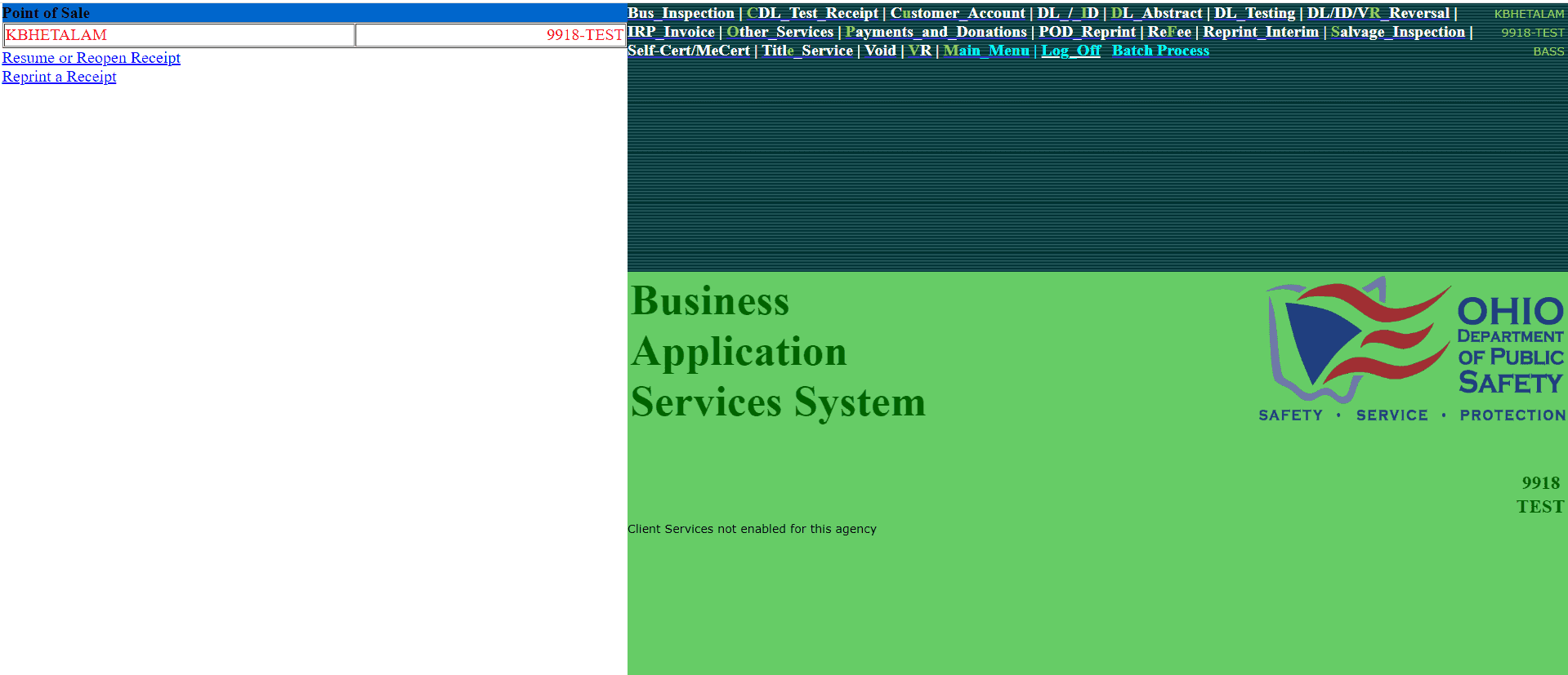
Ohio - Bureau of Motor Vehicle
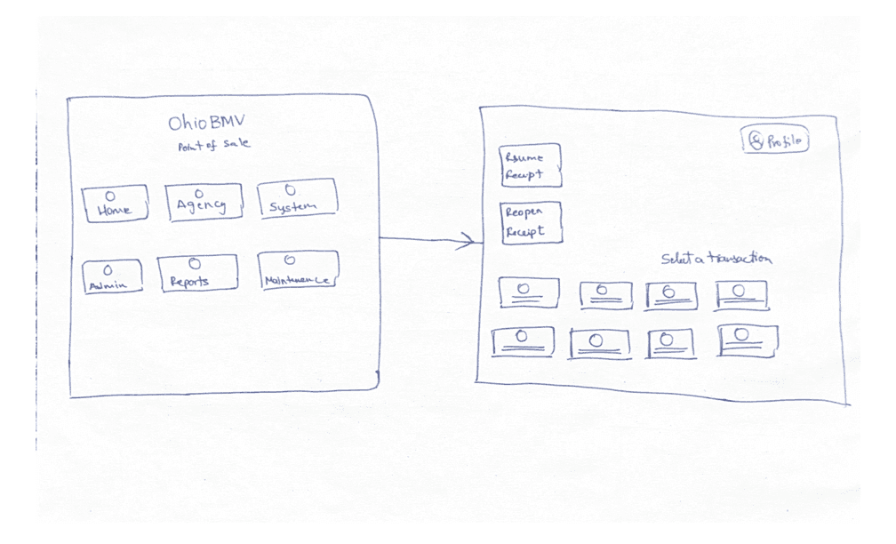
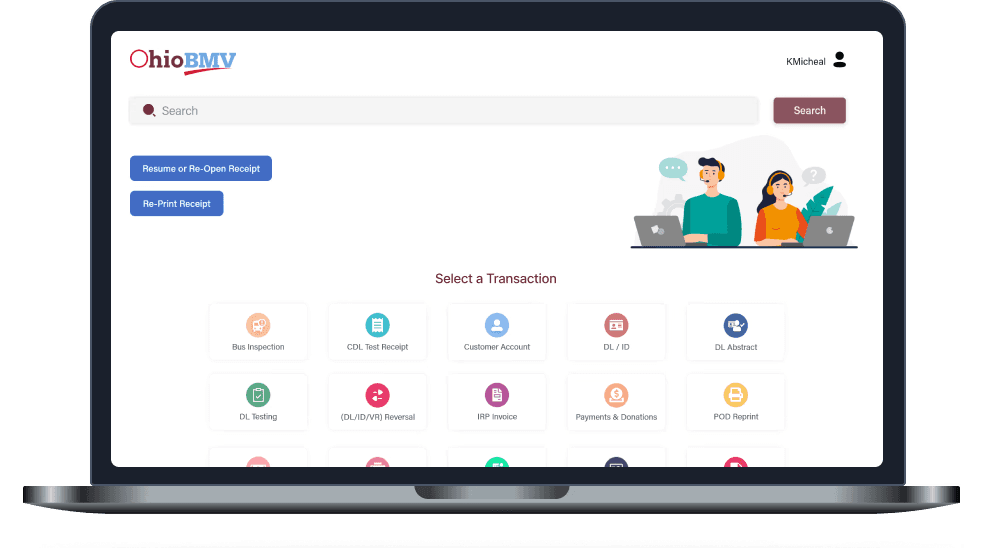
Point of Sale System - Legacy System Home Screen
"We’re moving our POS system to a new platform — not just to rebuild it, but to rethink and improve the experience"
This case study focuses on redesigning the homepage, the most critical entry point for daily operations.
First things First…
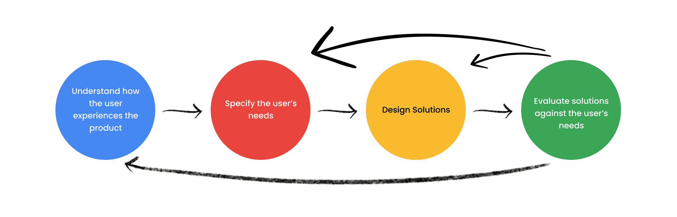
Establishing a Design Framework
But Why?
Without a shared structure, design decisions fragment quickly, especially in fast-paced, cross-functional teams.
The framework helped us stay consistent, reduce ambiguity, and focus on solving the right problems.
User Research
Users I'm Designing For
BMV Managers - 10%
Focused on oversight, efficiency, and operational visibility.
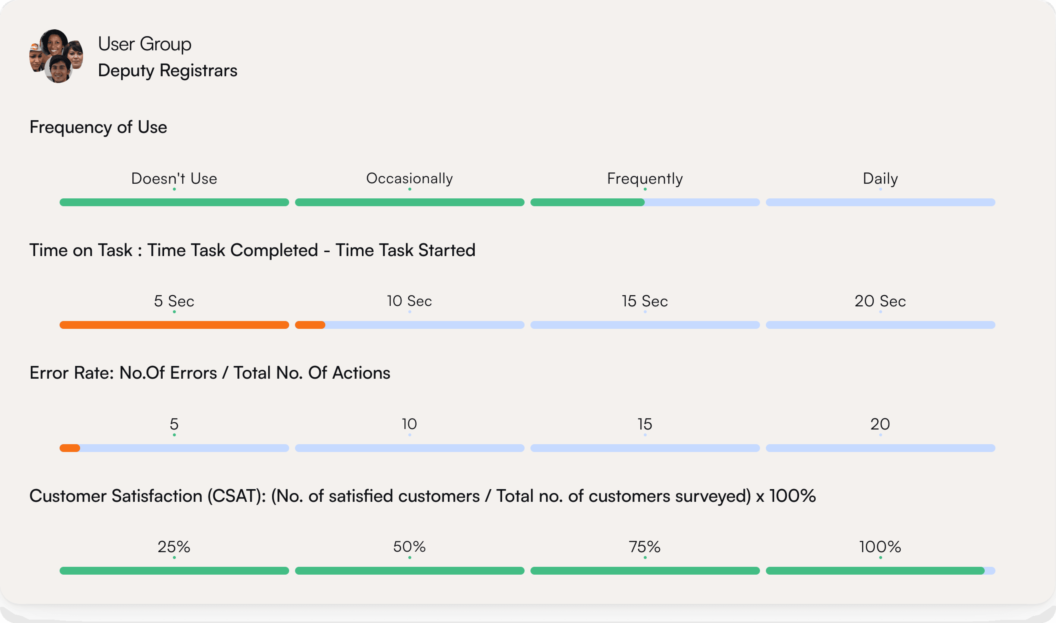
Deputy Registrar - 20%
Responsible for accuracy, compliance, and smooth daily operations.
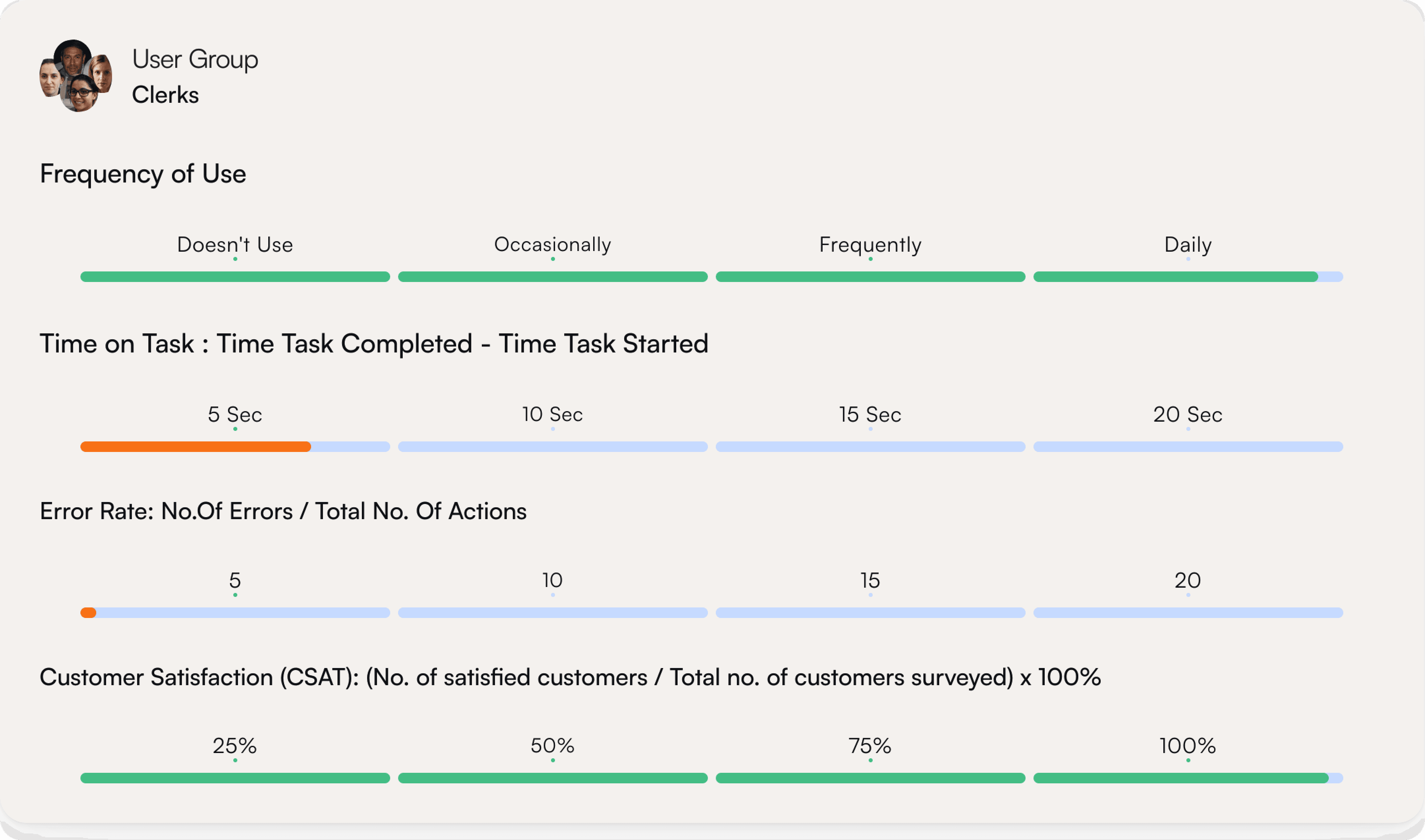
Clerks - 70%
Primary users handling high-volume transactions under time pressure.
65%
Dense, unstructured text slows scanning
Weak separation between sections
Small font sizes increase reading effort
Small targets increase the likelihood of mistakes
Lack of prioritization — everything feels equally important
User Impact
Slow Task Completion / Frequent misclicks or wrong workflows / Heavy Reliance on Training
20%
Important actions don’t stand out from secondary content
Similar styling across elements reduces distinction
Layout feels flat with no directional flow
Users must scan the entire screen to locate key action
User Impact
Eye strain / Slower scanning / Reduced trust / Exclusion of some users
15%
Colors compete instead of guiding attention
Visual inconsistency reduces predictability
Sections feel disconnected rather than unified
User Impact
Users get lost / High Error Rate / Confusion
5%
No personalization or shortcuts.
Lack of guidance for first-time users
Users rely on training instead of intuition
User Impact
Frustration over time / Reduced productivity / Lower satisfaction
BMV leadership Expressing their Pain Points

"We’re constantly bringing in new employees, and the system just isn’t intuitive enough for them to pick up quickly. We need something that reduces the learning curve and doesn’t rely on prior experience."
Leah Horne - BMV District Manager

“Right now, transactions are taking longer than they should. If we can’t speed up the process, it directly impacts how many customers we can serve in a day.”
Dennis Decekr - BMV Branch Manager

“It’s already hard enough to find and retain staff — we can’t afford a system that takes weeks to learn before someone becomes productive.”
Aliana Larsen - BMV Branch Manager

“With the turnover we have, we need a system that works for new employees on day one — not something they have to learn over time.”
Alana Branch - BMV Relations (Ohio Department)
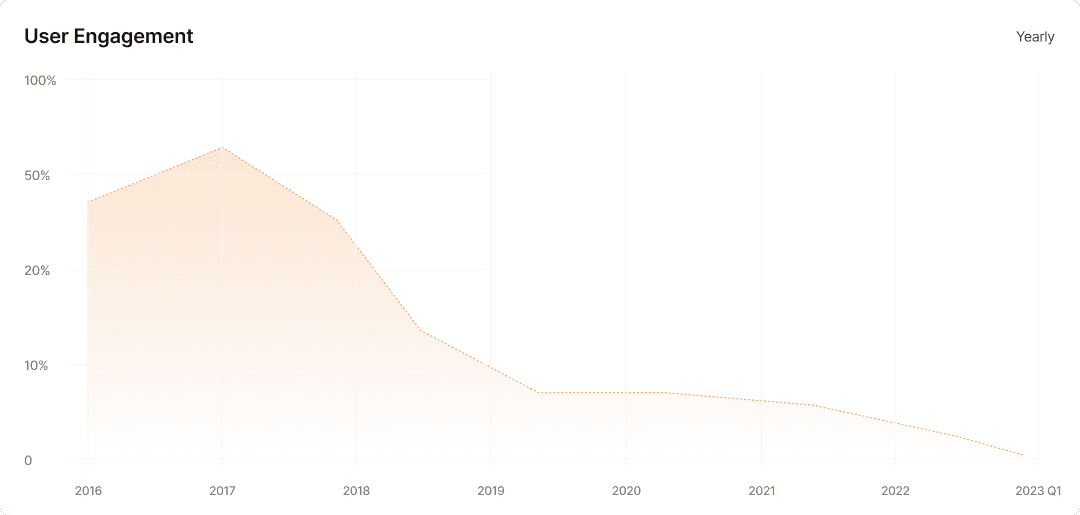
The 2017 update introduced a temporary spike in user engagement. However, without addressing core usability issues, engagement steadily declined over time.
This highlighted a critical gap: feature updates were prioritized, but underlying user pain points remained unresolved.
Synthesis & Key Insights
Speed is the core need — operators perform the same small set of tasks dozens of times a day. The interface should be designed around frequency of use, not an alphabetical or arbitrary list of every possible function
Visual noise is the biggest barrier — the absence of hierarchy, spacing, and grouping means operators carry the cognitive load that the design should be handling for them.
The left sidebar is the most underused opportunity on the screen — it's the natural home for the most frequent Point of Sale actions, yet it sits almost entirely empty.
Trust matters even on a static screen. A dated, chaotic design passively signals that the service behind it is the same.
Small design decisions have outsized consequences — a few pixels of extra spacing between links, a clearer type scale, and a logical grouping of the top strip would eliminate the majority of the pain points operators expressed.
Make the most used actions the largest elements on the screen
Establish a clear grid system so every element has a reason for where it sits on the screen
Apply a typographic scale — H1 for primary actions, H2 for section labels, body for supporting info — so hierarchy is built into the type system
Use proximity as a grouping tool — elements that belong together should be visually closer to each other than to unrelated elements
Apply information architecture principles — card sort the links into logical mental model categories that match how operators think, not how the system is built
Introduce a navigation pattern with clear affordance — tabs, a sidebar nav, or a grouped menu — instead of a flat undifferentiated list
Use consistent iconography alongside text labels to create dual-coding, making links faster to recognize than text alone
Group links under labeled categories so operators build a mental map of the interface rather than memorizing individual item positions
Apply the principle of least surprise — use UI patterns that match conventions operators already know from everyday digital tools
Build visual consistency into every repeated element so once an operator learns one pattern, they can apply it everywhere on the screen
Use affordance-driven design — buttons should look like buttons, links should look like links, so no element requires prior knowledge to understand
Now the Fun Part
Comparable Analysis
But Why?
To ground the redesign, I analyzed comparable systems to understand common patterns, strengths, and gaps.
The goal wasn’t to replicate solutions, but to identify what works, what doesn’t, and where we could improve.
From Idea to Structure
Sketching Early Concepts
I explored multiple layout directions to test how information could be structured more effectively.


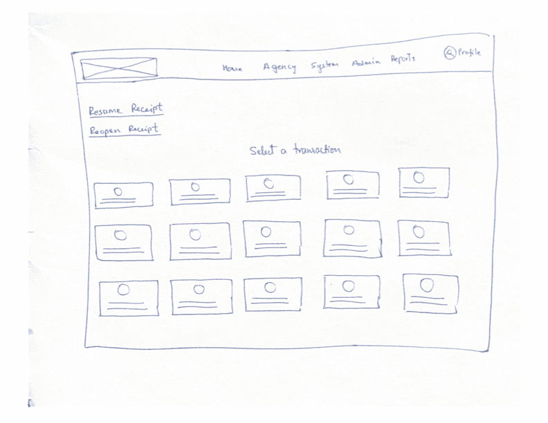


Designing the Hi-fi Mockups
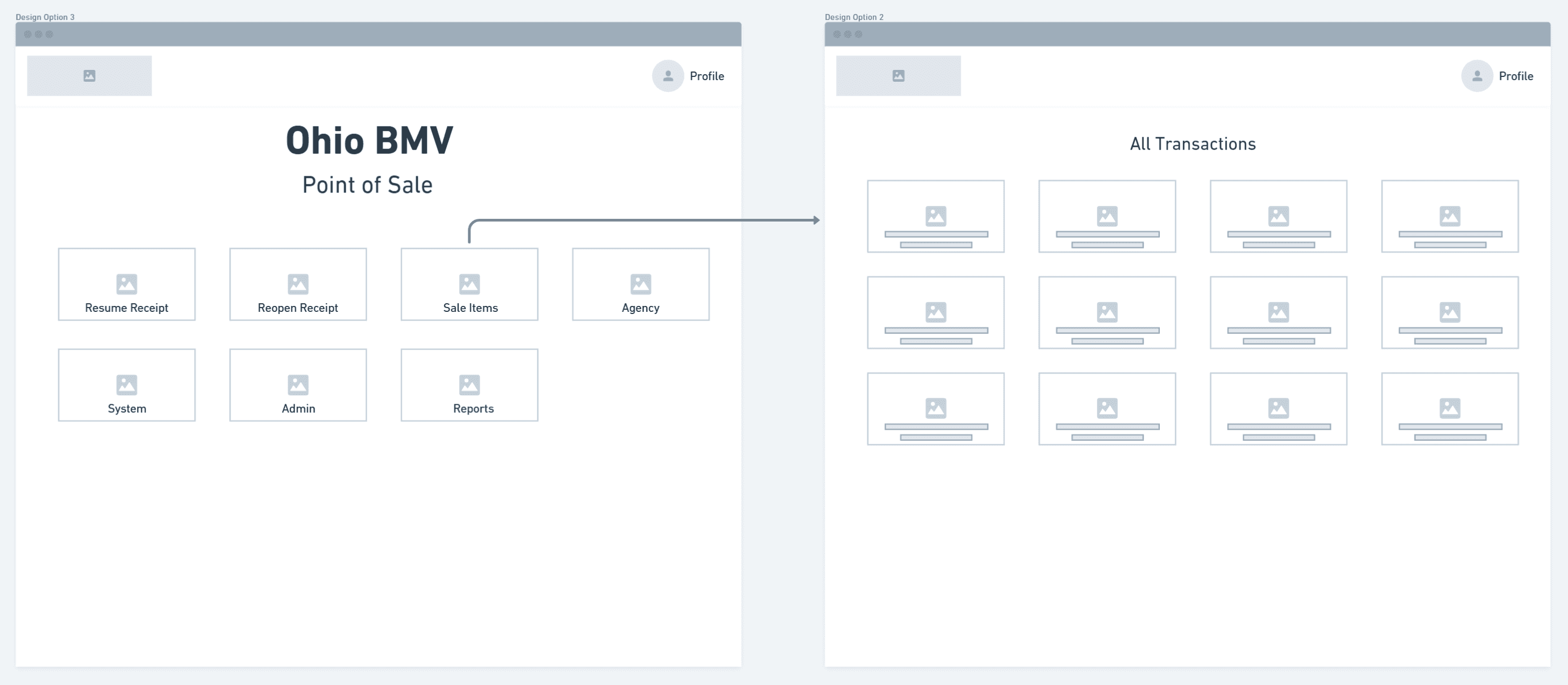
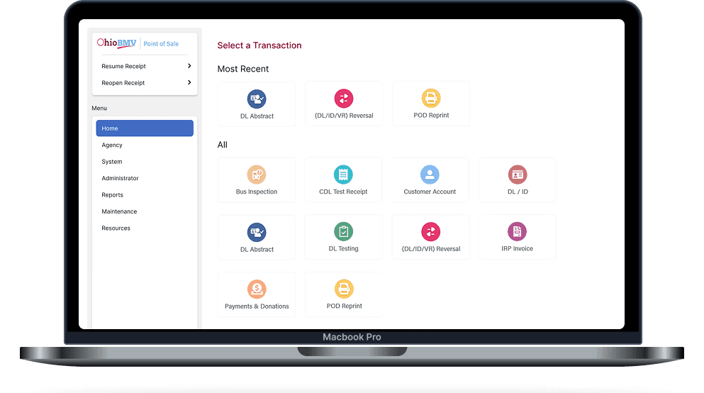
Layout Option 1
Applying Hick's Law by reducing the number of visible choices to decrease decision time
Search bar follows Fitts's Law by making it the largest and most reachable target on the screen
The different colors for each icon helps users to catch the item they are looking for quickly. Once they get used to it they would go by color coding rather than reading the label
As a back up icon and label pairing lets operators recognize actions through visual pattern recognition
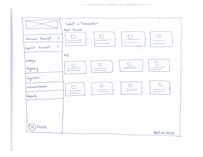
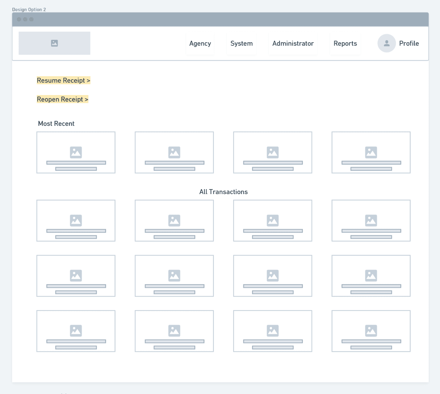
Layout Option 2
Categorized sidebar uses the Gestalt principle of proximity to enable mental mapping over memorization
“Most Recent” prioritizes frequent tasks, reducing interaction cost via visual hierarchy
Larger, well-spaced targets reduce accidental clicks under time pressure
Labels & icons support recognition over recall per Nielsen’s usability heuristics


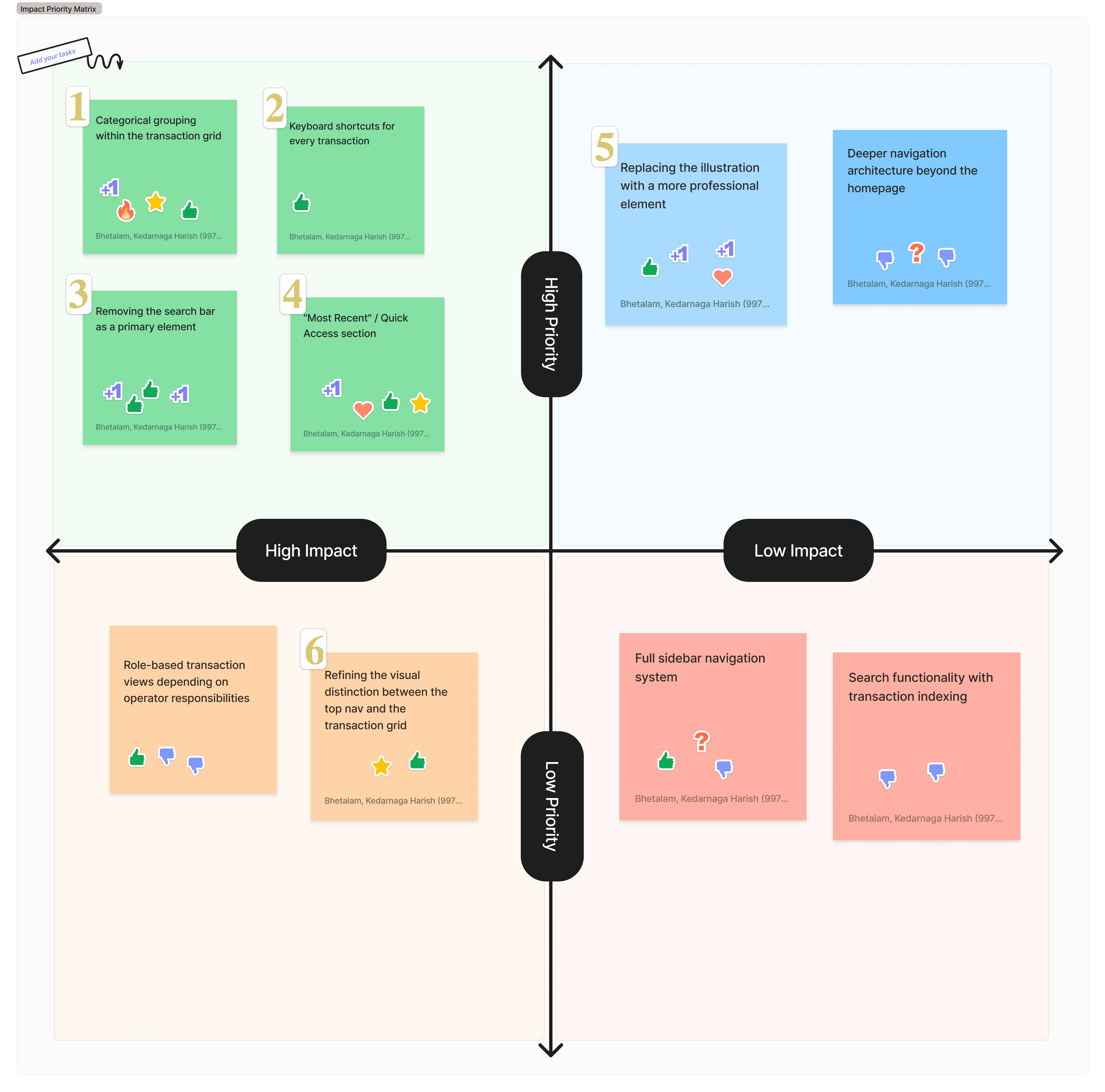
I mapped user feedback based on priority and impact to identify what needed immediate attention versus what could be addressed later. This helped focus design decisions on changes that would meaningfully improve the user experience.
Updating the Design
I aligned with business and technical stakeholders to review user feedback and identify what could be incorporated without expanding scope.
Key Improvements
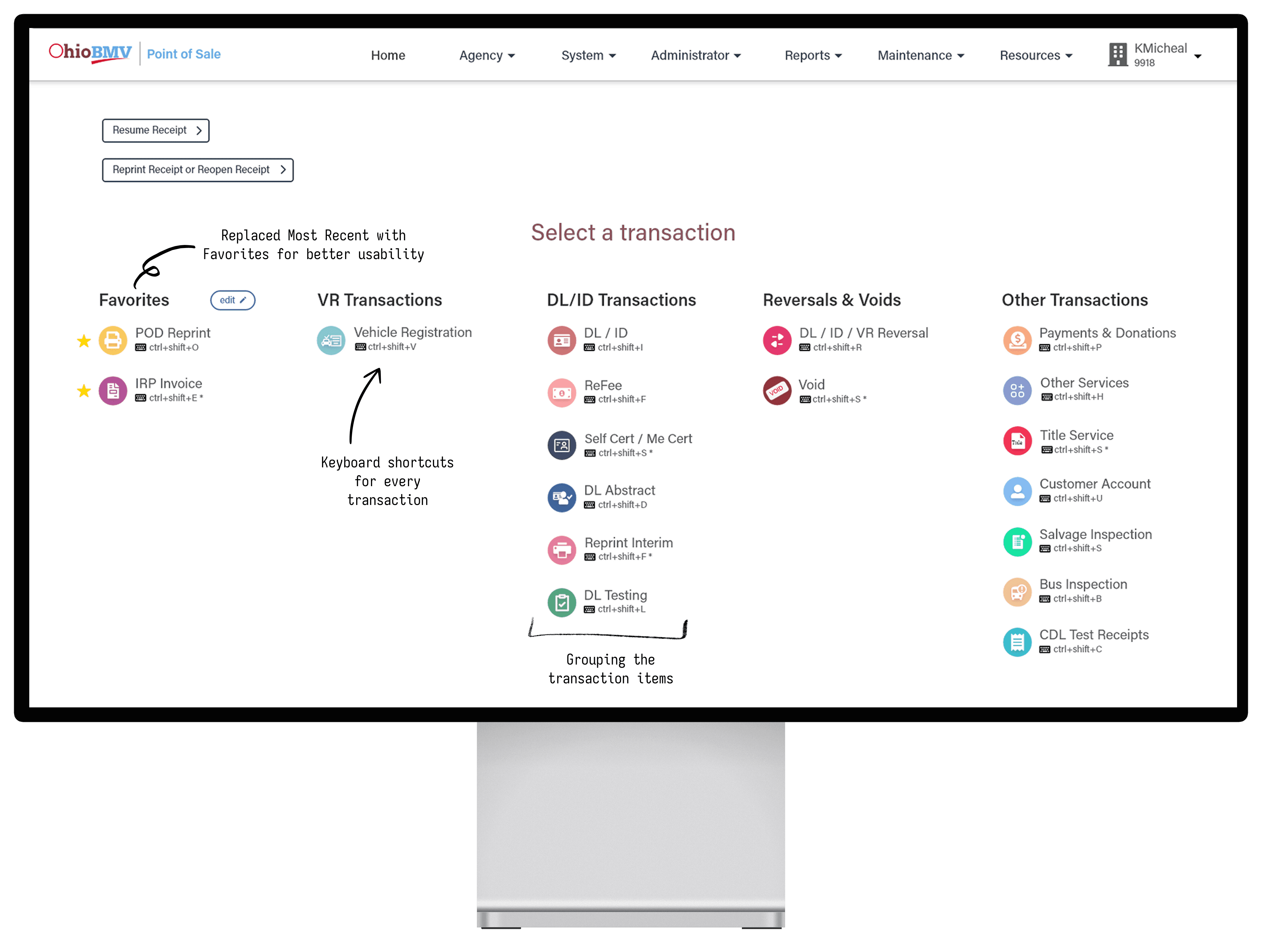
User-Controlled "Favorites"
During a feedback alignment session, I proposed replacing the “Most Recent” section with a Favorites feature—giving users control over frequently used items instead of relying on system-generated behavior.
Flexible Transaction "Grouping"
This was a key insight from early user research, but I initially excluded it due to business concerns around grouping—specifically how evolving transactions or new features might not fit cleanly into predefined categories.
Faster Access with "Shortcuts"
This insight emerged during testing of the initial designs and wasn’t identified in earlier research, but it proved critical as it directly impacts daily operations and time efficiency per customer.
Final Validation
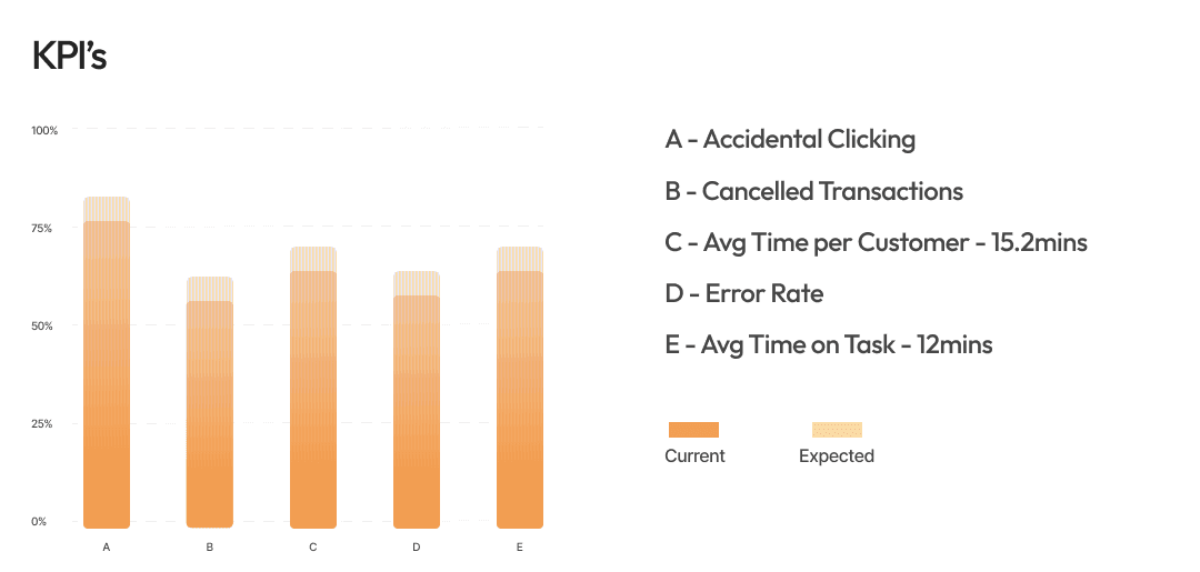
User Task 1: A customer is at your window — find and launch a Vehicle Registration transaction as quickly as you can
User Task 2: Resume a previously opened receipt starting from the homepage
User Task 3: You are a first day operator with no training — using only what you see on screen, find where you would go to start a new transaction
User Task 4: Find the DL Abstract transaction and tell me how you located it
User Task 5: Now use the keyboard shortcut for the same transaction — tell me how you feel about having it displayed on screen
User Task 6: Find the Void transaction — tell me which category you expected to find it under before you looked
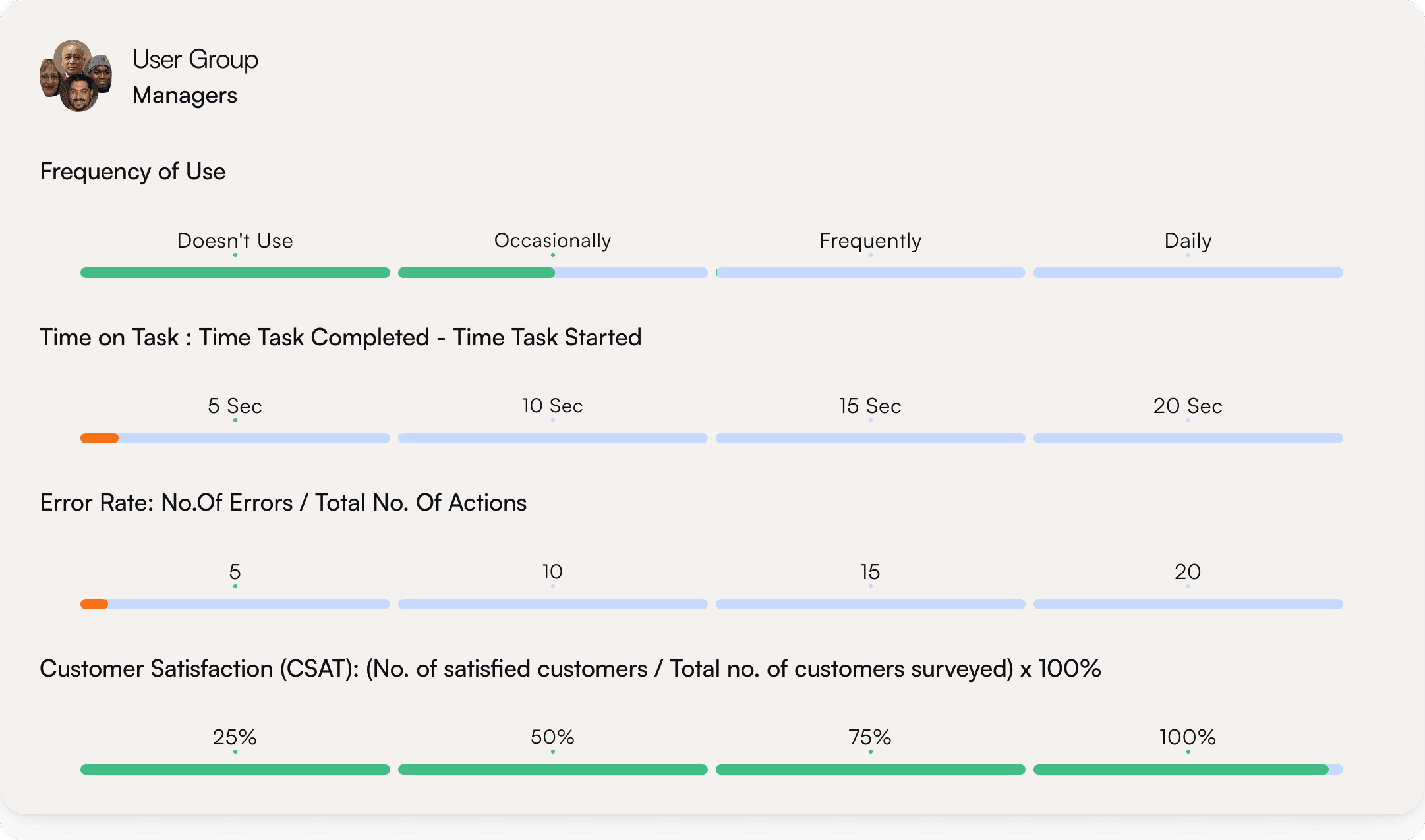
What We Measured
Enhancements in the Pipeline
Inclusive Design
Shift the UI further toward inclusive design. While the current MVP leverages strong color cues and iconography to support quick recognition and align with the problem space, future iterations would focus on improving accessibility and ensuring the experience works across a broader range of user needs
Role-Based Homepage


Currently, the homepage shows all transactions to every operator, regardless of role. A future enhancement would tailor the transaction grid based on roles (e.g., Clerk, Manager, Deputy Registrar), surfacing only what’s relevant to their responsibilities and further reducing cognitive load.
© 2023. Designed by Harish Bhetalam